Try at firts with really simple plot examples
# Simple plot

# import necessary libraries
import matplotlib.pyplot as plt
import numpy as np

# define number of samples to generate
n = 300
# create linear space from -x to x
X = np.linspace(-5, 5, n, endpoint=True)
# create vectors
A, B = np.cos(X), np.sin(X)
# plot cosine
plt.plot(X, A)
# plot sine
plt.plot(X, B)

# show finished plot
plt.show()

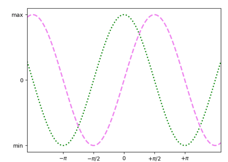
Changing colors and type of lines, adding extremas
# plot cosine
plt.plot(X, A, color="green", linewidth=2.1, linestyle=":")
# plot sine
plt.plot(X, B, color="violet",  linewidth=2.3, linestyle="--")
#set x and y limits to 120% of extremes
plt.xlim(-5, 5)
plt.ylim(-1.1, 1.1)
Adding dedicated values into x- and y-sticks:
# create latex-style labels for ticks
plt.xticks([-np.pi, -np.pi/2, 0, np.pi/2, np.pi],
          [r'$-\pi$', r'$-\pi/2$', r'$0$', r'$+\pi/2$', r'$+\pi$'])

plt.yticks([-1, 0, +1],
          [r'min', r'0', r'max'])
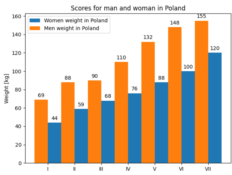
labels = ['I', 'II', 'III', 'IV', 'V', 'VI', 'VII']
women_median_weight_PL = [44, 59, 68, 76, 88, 100, 120]
men_median_weight_PL = [69, 88, 90, 110, 132, 148, 155]

x = np.arange(len(labels))  # the label locations
width = 0.5  # the width of the bars

fig, ax = plt.subplots()
A = ax.bar(x + width/2, women_median_weight_PL, width, label='Women weight in Poland')
B = ax.bar(x - width/2, men_median_weight_PL, width, label='Men weight in Poland')

# Add some text for labels, title and custom x-axis tick labels, etc.
ax.set_ylabel('Weight [kg]')
ax.set_title('Scores for man and woman in Poland')
ax.set_xticks(x)
ax.set_xticklabels(labels)
ax.legend()

def autolabel(rects):
    """Attach a text label above each bar in *rects*, displaying its height."""
    for rect in rects:
        height = rect.get_height()
        ax.annotate('{}'.format(height),
                    xy=(rect.get_x() + rect.get_width() / 2, height),
                    xytext=(0, 3),  # 3 points vertical offset
                    textcoords="offset points",
                    ha='center', va='bottom')

autolabel(A)
autolabel(B)
fig.tight_layout()
plt.show()