
Today I searched for real public data from Statistics Poland site in OH&S area (occupational safety and health) and downloaded report titled:
Accidents at work and related health problems
with work in the second quarter of 2020 (dated:15/12/2020)
For first table with data, I found on second page, I created simple pie diagram as follow:
import pandas as pd
import matplotlib.pyplot as plt
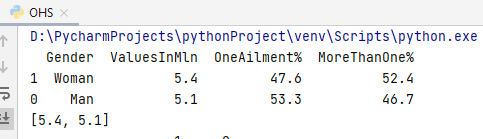
OHS_file = pd.read_table(
'OHS_2Q2020.txt', sep=",", skiprows=[0,3,4,5],
names=['Gender','ValuesInMln','OneAilment%',
'MoreThanOne%'],
)
df = OHS_file.sort_values('ValuesInMln',ascending=False)
print(df)
A = list(df['ValuesInMln'])
print(A)
# Pie chart
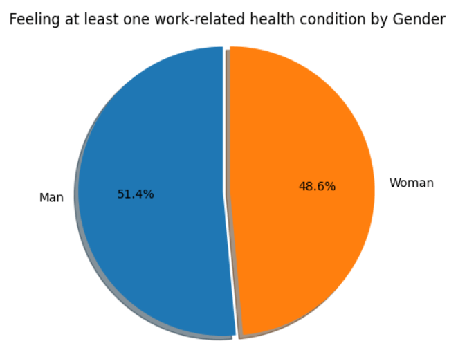
labels = 'Man', 'Woman'
sizes = A
explode = (0, 0.05)
fig1, ax1 = plt.subplots()
ax1.pie(sizes, explode=explode, labels=labels,
autopct='%1.1f%%',
shadow=True, startangle=90)
ax1.axis('equal')
plt.title("Feeling at least one"
work-related health condition by Gender")
plt.show()
import pandas as pd
import matplotlib.pyplot as plt

OHS_file = pd.read_table(
    'OHS_2Q2020_accidents.txt', sep=","
)
df1 = OHS_file[0:4]
print(df1)

X = list(df1['DaysAtWork'])
print("X:",X)
A = list(df1['Volume[%]'])
print("A:",A)

# Pie chart
labels = X
sizes = A
explode = (0, 0, 0, 0.1)

fig1, ax1 = plt.subplots()
ax1.pie(sizes, explode=explode, labels=labels,
         autopct='%1.1f%%',
         shadow=True, startangle=90)
ax1.axis('equal')
plt.title("Accidents at work-the examination
by days incapacity for work")
plt.legend()
plt.show()
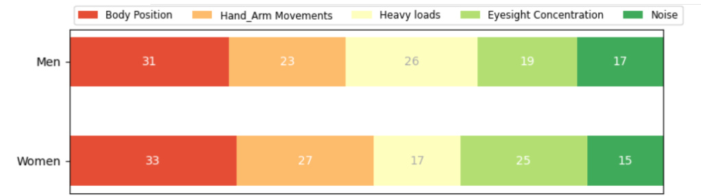
Employed persons by gender and groups of workplace factors adverse effects on physical health
import pandas as pd
import matplotlib.pyplot as plt
import numpy as np

OHS_factors = pd.read_table(
    'OHS_2Q2020_factors.txt', sep=","
)
print(OHS_factors[0:5])

factors = list(OHS_factors['Factor'])
Factors = factors[0:5]
print("X: ", Factors)

man = list(OHS_factors['Man'])
Men = man[0:5]
print("Men:",Men)

woman = list(OHS_factors['Woman'])
Women = woman[0:5]
print("Women:",Women)

Horizontal bar chart
def survey(results, category_names):
    labels = list(results.keys())
    data = np.array(list(results.values()))
    data_cum = data.cumsum(axis=1)
    category_colors = plt.get_cmap('RdYlGn')(
        np.linspace(0.15, 0.85, data.shape[1]))

    fig, ax = plt.subplots(figsize=(9, 2.5))
    ax.invert_yaxis()
    ax.xaxis.set_visible(False)
    ax.set_xlim(0, np.sum(data, axis=1).max())

   for i, (colname, color) in enumerate(zip(category_names,
                                             category_colors)):
        widths = data[:, i]
        starts = data_cum[:, i] - widths
        ax.barh(labels, widths, left=starts, height=0.5,
                label=colname, color=color)
        xcenters = starts + widths / 2

        r, g, b, _ = color
        text_color = 'white' if r * g * b < 0.5 else 'darkgrey'
        for y, (x, c) in enumerate(zip(xcenters, widths)):
            ax.text(x, y, str(int(c)), ha='center', va='center',
                    color=text_color)
    ax.legend(ncol=len(category_names), bbox_to_anchor=(0, 1),
              loc='lower left', fontsize='small')

    return fig, ax

survey(results, category_names)
plt.show()
Data Visualisation – bar chart
